
Commercial Painting
2027 Commercial Paint Trends for Offices & Retail Spaces
· 5 min read
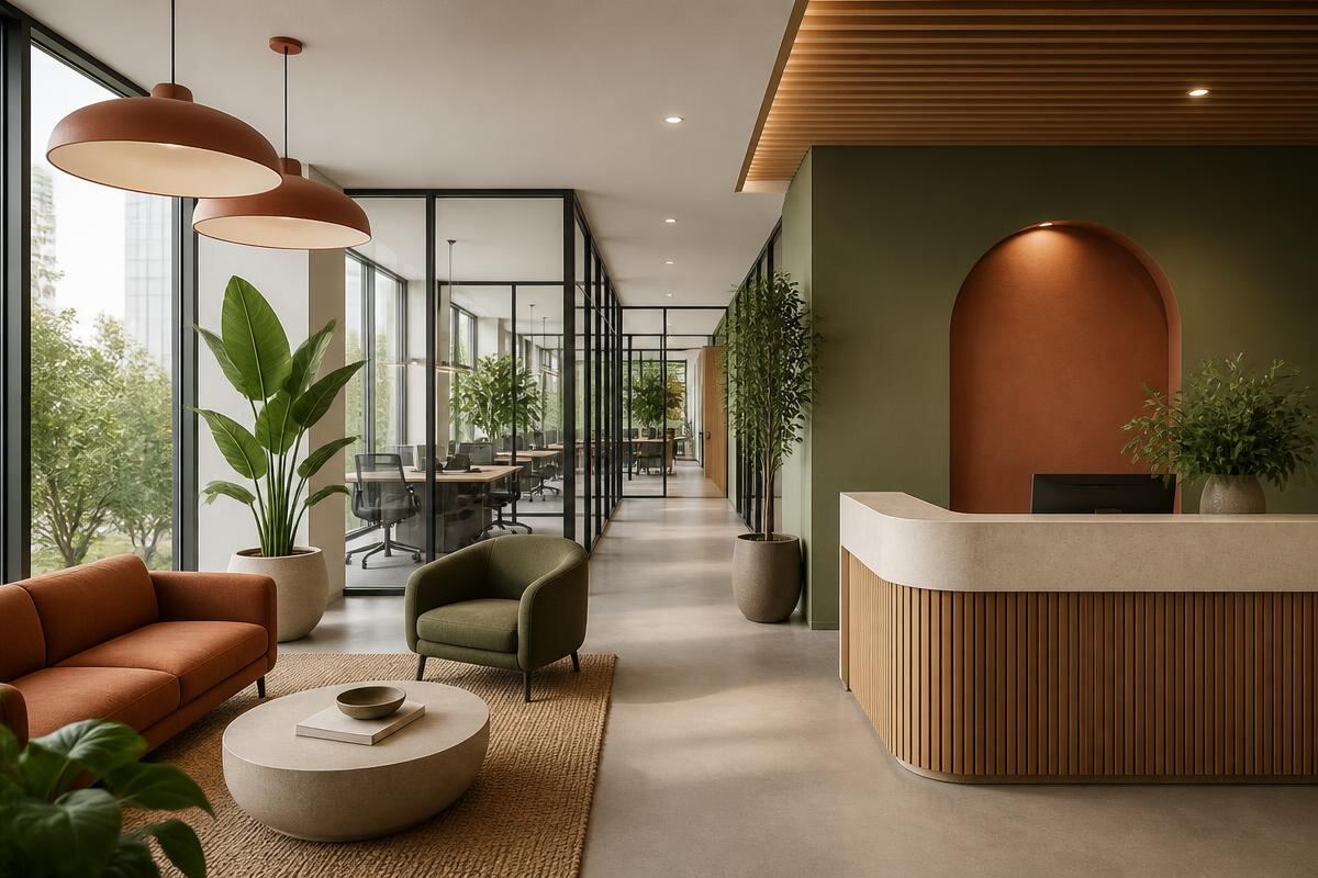
Color in a commercial space does more than decorate. It signals how a company wants people to feel: focused in workstations, welcome in lobbies, and confident in conference rooms. The 2027 direction moves away from sterile white toward colors that ground the space and hold up to real traffic.
Colors for productivity and focus
Focus-enhancing muted olive greens and deep blue-grays are replacing bright accent walls. These colors are calm enough to work in all day while still giving the space a designed, intentional feel. In open-plan offices, they help visually separate zones without building walls.
Welcoming reception and retail areas
First impressions happen in the lobby. Warm terracottas, clay tones, and warm taupes create an inviting experience that feels curated rather than corporate. Pairing these wall colors with natural wood, soft lighting, and greenery turns a reception area into a place people remember.
Conference rooms and high-impact spaces
Conference rooms are ideal for color-drenching: painting the walls and trim in one deep, cohesive tone for a moody, high-end effect. Deep mineral tones, navy, or rich plum-bronze work well on camera and give the room presence without being distracting.
Durable commercial finishes
Hallways, breakrooms and shared spaces take abuse. Scrubbable, scuff-resistant, low-odor coatings such as Benjamin Moore Scuff-X allow walls to be wiped down without losing sheen, and they keep the building usable during off-hours painting.
Low-VOC and off-hours scheduling
Occupied spaces need low-odor products and a schedule that does not interrupt work. We paint evenings, overnight, and weekends in sections, protecting floors and furniture each night and resetting the space before your team returns.